Service management platform
Delivering consistently great services should be easy – even when you’re busy. It’s why we made TOPdesk: a platform that simplifies life at the IT service desk, so you have more time for the work that wows.
- Quick to set up with templates and best practices
- Easy to tweak for continual service improvements
- Enjoy guidance from real people, every step of the way
5000+ organizations make service happen with TOPdesk

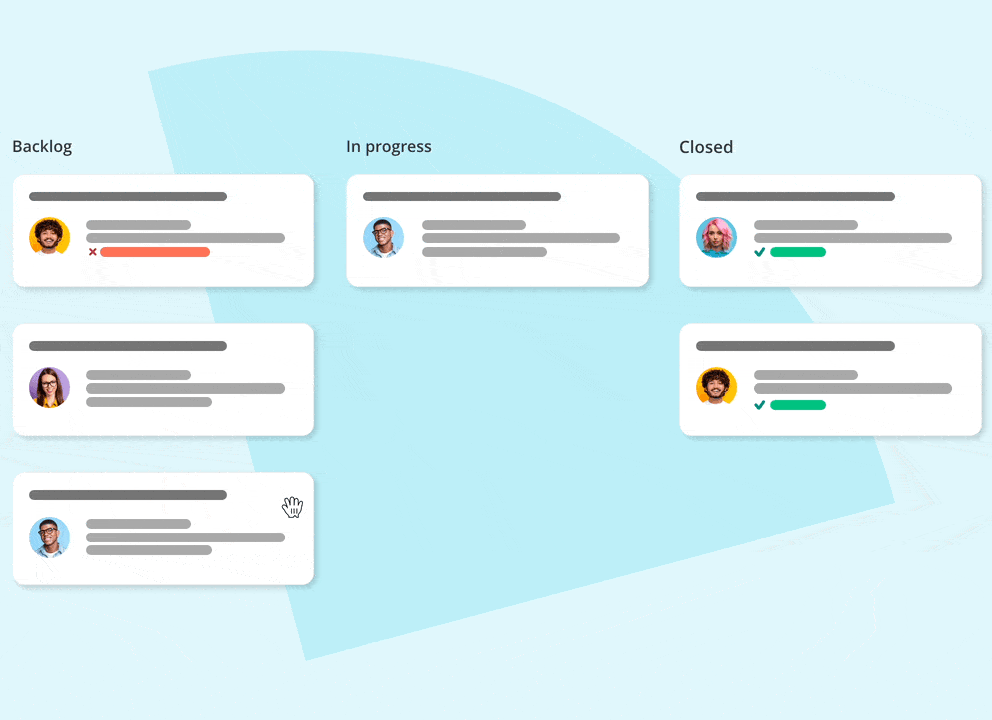
Beat that workload. You’ve got this.
You’re no longer drowning in requests. Customers are in awe of your transparent, punctual services. You have standard processes in place. Not a fantasy. TOPdesk’s got you covered.


Small improvements, big smiles
Implementing big changes is so 2020. Not to mention risky. TOPdesk was created to help IT service teams try out small, achievable ideas – one step at a time. Automate those password resets. Share FAQs. Implement self-service. See what works, and what doesn’t. The result? A happy service team that’s ready to impress.
Let’s start improving

You’ll love TOPdesk if you value…

A quick start, backed by experts
TOPdesk is a standard tool that’s flexible enough to personalize. Our experts use 25+ years of best practices to get you started in no time – guaranteed success, without the heavy lifting.

Making improvements yourself
Once set up, TOPdesk is easy to use and maintain – without coding or help from consultants. Tweak the software as your needs change, so your service delivery continues to hit the mark.

A personal approach
Enjoy guidance from real, in-house people who care about your success – from Sales to our 24/5 Support team. You’ll join a community of like-minded peers and experts, here to cheer you on as you grow.
The latest content for service professionals


